My design work extends across a wide range of media, and I don't think about it as something wholly separate from other creative work such as art and writing. Rather, it is a specific way of addressing structure and intentions and something that fosters useful forms of critical thinking about the made world. Since the mid 1990s I have been creating the visual and environmental design for my multimedia performance works. The fonts shown here are all Type 1 PostScript fonts. I am happy to make them available for free to anyone who wants to use them in a publication. They're incredibly time-consuming, so I haven't made any new ones in a very long time.
Reading Frankenstein (2019)
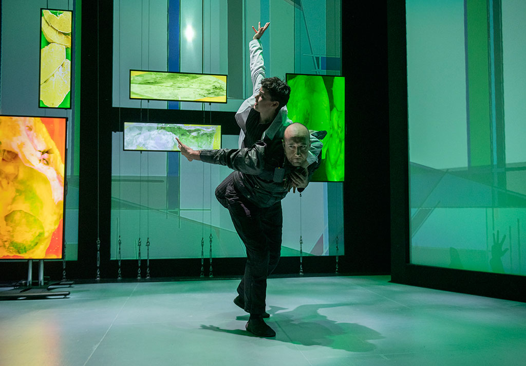
2019. I worked with director Annie Loui and the script and with lighting designer Lonnie Alcaraz on the set design for this multimedia performance work, which used data projectors to provide much of the set and the lighting. Premiere at the Contemporary Art Center (Irvine, CA).
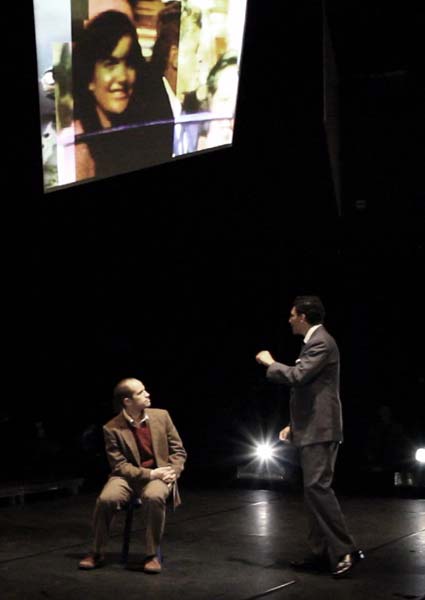
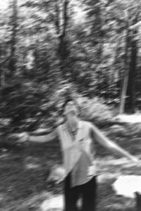
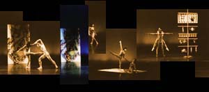
Reading Frankenstein (2003)
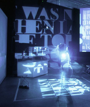
2003. I worked with director Annie Loui and lighting designer Lonnie Alcaraz on the set design for this multimedia performance work, which used data projectors to provide most of the stage illumination. Altogether there were 5 projection screens/areas and 3 tv monitors, for which I created projections and videos. Premiere at the Beall Center for Art + Technology (Irvine, CA).
A new version of the piece was produced in 2019.
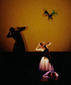
Playing the Rapture
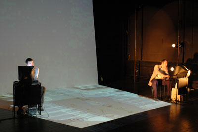
2008. I was the set and video designer for this performance work, which featured use of projected machinima videos on floor and wall in order to immerse the performers in their game world (here visible under their feet). In many scenes, the video projections also served as the primary theatrical lighting. It premiered at the Baltimore Theatre Project.
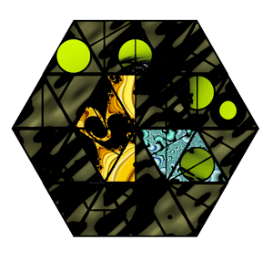
Playing the Rapture: installations
2009. For two installations related to my Playing the Rapture project, I reworked the hexagonal environmental design of the original performances. In the tabletop installation at left for the California Museum of Photography, video of the performance was projected onto a scale model of the original set. This 'reperformance' merged the performers with their projection environment, while simultaneously mapping them onto a miniaturized architecture of computer consoles.
The larger-scale installation at right for the Gallery@CalIT2 wwas designed with video of the two protagonists occupying separate monitors suspended at about head height, creating a surrogate 'body' for each performer. Edited video of the environmental projections, scaled down and projected on wall and floor, replicated the original performance environment.
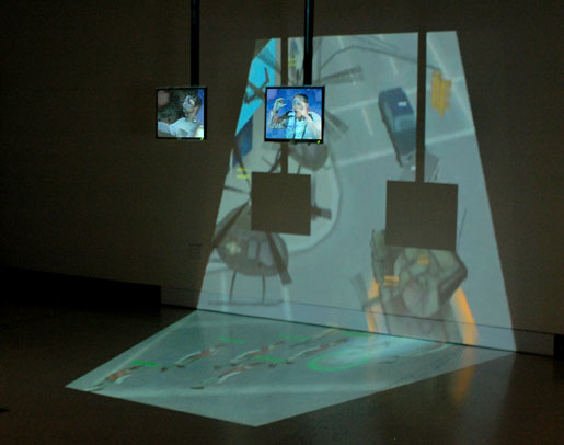
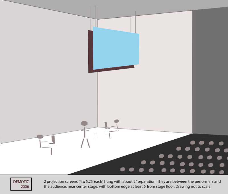
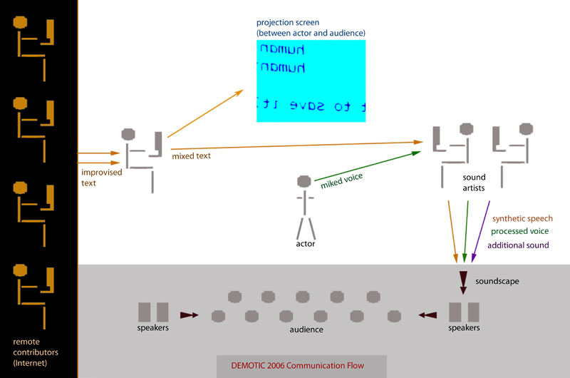
Demotic
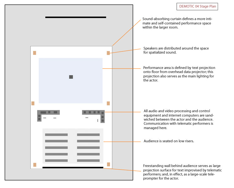
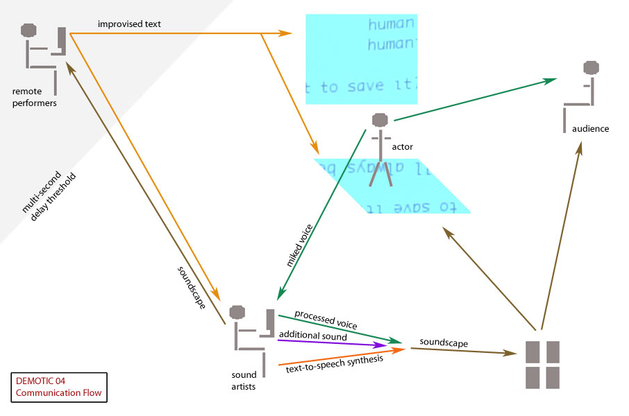
I was the set co-designer (with director Robert Allen) and telematics designer for this mixed-reality performance work. The design focused on maximizing the audio elements of the piece, which included spatialized, realtime text-to-speech synthesis, vocal improvisation, voice processing, sound improvisation, live music, and sound sampling. The piece included both local and remote performers. Workshopped at the Beall Center for Art + Technology (Irvine, CA).
The images above pertain to the 2004 version of the piece. It was subsequently reimagined and redesigned for a 2006 production at the Baltimore Theatre Project, the designs for which are shown below.
Trojan Waltz
1991. Set design for dance theater duet included slide projections designed to create an effect of movement using still images. Choreographer: Robert Allen. Premiere at Schoenberg Hall (Los Angeles).
Galileo in America
2012. This brechtian project was designed with tennis-court-style seating, and on a very intimate scale. The stage was kept very bare, and most of the environmental elements that would traditionally be represented by set objects were instead projected on three scrims hanging above the heads of the performers, creating a kind of metaphysical 'second stage' or mind-space for the piece. Live cellphone footage was also used during the piece. It premiered at the Contemporary Arts Center at UC Irvine.
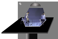
The Roman Forum Project
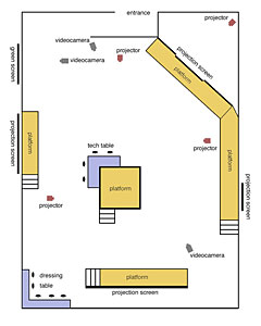
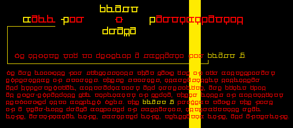
2003. I was the environmental set co-designer (with director Robert Allen) for this mixed-reality performance work. The design featured several widely spaced, raised platforms for the performers (yellow areas), 1 rear-projection screen, and 3 front-projection screens of various sizes. The violet areas indicate 'backstage tech' of the kind that is normally hidden from the audience. The main tech controls (audio, video, internet) were placed dead center in the space, while the dreassing room was in a corner. A live-video green-screen area was also visible to the audience, which circulated throughout the space as the piece progressed. Premiere at the Beall Center for Art + Technology (Irvine, CA).
Le Ménage
1998. Projection co-designer for this play by Aida Croal. The projections visually told the story of events at a picnic. The images were shot in high-contrast black-and-white. Director: Robert Allen. Premiere at LaMama E.T.C. (New York).
Cattle Calls & Other Long-Distance Tails
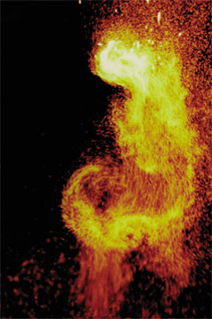
1991. My environmental elements for this dance theater work included 7-foot fire columns and mixed-media sculptures. Choreographer: Heidi Duckler, Collage Dance Theater. Premiere: Powerhouse Theater, Santa Monica.
Foundations
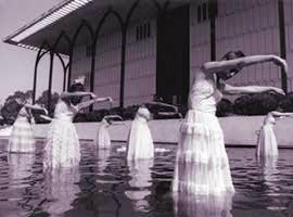
1990. This site-specific work by Heidi Duckler + Collage Dance Theatre was performed in and around a reflecting pool at Loyola Marymount University, L.A. My set elements included floating fluorescent letters, reconfigured fishing equipment, and a rusty bicycle.
Roaring
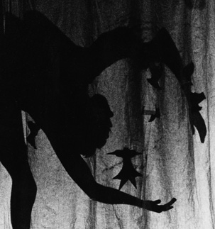
1991. Set designer and writer for this interdisciplinary theater work. The piece incorporated dance, live musicians, a singer, a shadow play, and a monologue. Choreographer: Robert Allen. Premiere at Schoenberg Hall (Los Angeles).
Love It to Death
1990. Set design for work by Gary Palmer Dance Company included fantastically reconstructed automobile parts. Premiere: Theater Artaud, San Francisco.
I Throw Her in the Air
1990-91. Set design for dance theater duet included abstract wooden armature and fish. Choreographer: Robert Allen. Premiere at the Los Angeles Open Festival, 1990; repeated at Schoenberg Hall in 1991.
The Opposites, On Ascent and Descent,
and the Fool Sought After
1988. Set design for work by Gary Palmer Dance Company included a hanging rope ladder and a moveable folding screen that also served as a dance platform. Premiere: Bay Area Dance Series, Laney College, Oakland, CA.
Checco 1999
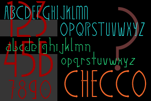
Checco pays homage both to the elegant circuitry of microCHips and the streamlined forms of art dECO. This sample of Checco shows the strong contrast between the tall capitals and the lowercase letters. Checco was used as the display font in the bookBenjamin's Blind Spot. It has two weights, regular and bold.
TriHexal 1999
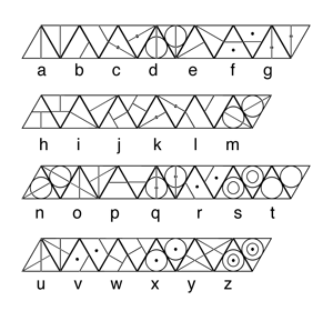
TriHexal is a font in which all the letters take the form of triangles. It was designed especially so that it would be possible to create geometric forms from words typed in this font. For this reason, each letter has two fors, an upward-pointing triangle, and a downward-pointing triangle. The fact that the base form is a triangle makes it easy to create hexagons with these letters; hence the name "TriHexal." The 'image' above right is actually this poem: "today / allgods / aregone / where".
Cross 1996
The Cross font was designed specially for use in a Web project, the X-Art Foundation's blast5drama. The letterforms contain only right angles for crispness in a pixel-based environment. It was a tongue-in-cheek attempt to make a font that would be simultaneously legible and cryptic. It is named for Marlena Corcoran's story, "Crossroads," as each letter itself forms a miniature crossroads.
UnCross 1999
UnCross is a legible variant on my Cross font.
Vilhelm 1995
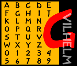
Vilhelm is a display font created and named in honor of Richard Wilhelm, the great translator of the I Ching.
Forger 1995
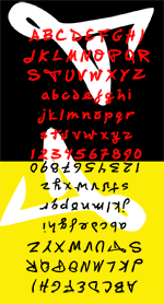
Forger is a font very loosely based on my own handwriting (and a good deal more legible!). It has two weights, regular and bold.